Appearance
用积木理论设计一个灵活好用的 Carousel 走马灯组件
之前写了一篇前端开发的积木理论,给大家分享了我的组件设计价值观,有小伙伴评论:
看完了,好像感觉又没看

主要是那篇文章比较偏理论,列举的案例也太简单,因此决定写一篇实战类的文章。
接下来我以Carousel走马灯组件的设计和开发为例,给大家分享如何实践积木理论。
积木理论有几个关键思想,其中抽象和分层是最核心的思想。
1 抽象出 Carousel 组件的核心
开发Carousel组件之前,我们先随便找一个涉及该组件的场景,比如掘金活动页面里的这个:
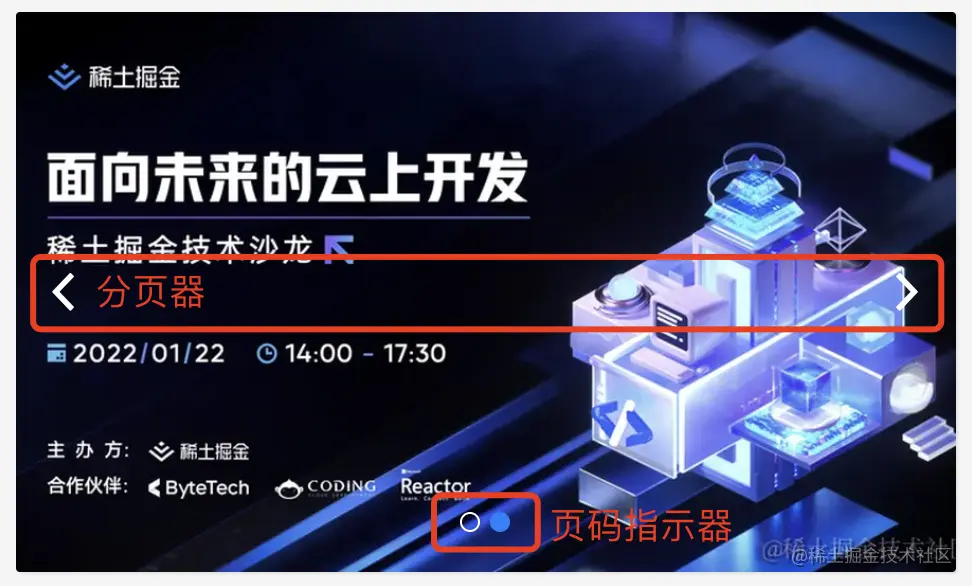
先分析下这个组件的组成部分和核心交互。
比较直观能感知到的就是组件的组成部分,Carousel组件主要有以下三个组成部分:
- 核心的
内容区域 - 中下区域的
分页指示器 - 左右的
分页按钮
Carousel组件的核心交互其实是一个分页功能,不管是点击分页指示器中的小圆点还是点击左右分页按钮,都是对当前内容进行切换(即分页)。
而分页功能的核心包含两部分:
- 当前页码
- 切换页码的动作
2 实现Carousel组件的核心分页功能
将组件的核心分析清楚之后,我们先不着急画界面,先实现其中最核心的分页功能,这部分是UI无关的,也是框架无关的,我们选择用Vue3的Composition API来实现。
在之前跟村长老师的直播中,我们已经手把手教大家从0搭建一个组件库,这里捡其中关键的几个步骤,详细的可以去看之前的文章和视频。
- 初始化一个工程
Vite+Vue3+TypeScript:yarn create vite mini-vue-devui --template=vue-ts - 引入
jsx并在vite.config.ts中配置:yarn add -D @vitejs/plugin-vue-jsx - 安装
sass:yarn add -D sass
以上三个步骤就能初始化一个我们需要的vue工程环境,这时我们可以设计好目录结构,完全按照Vue DevUI开源组件库的规范来。
在src/components下创建组件目录carousel,并按照以下目录结构组织文件:
carousel
├── __tests__ ## 单元测试
|  └── carousel.spec.ts
├── index.ts ## 组件入口文件
└── src ## 组件源码
   ├── carousel.scss ## 组件样式
   ├── carousel.tsx ## vue组件
   └── composables ## 组件逻辑(Composition API)
└── use-page.ts我们聚焦在use-page.ts,这是一个Composition API,用于实现Carousel组件的分页功能。
这个文件应该导出一个usePage的方法,方法里面导出:
- 当前页码
pageIndex - 一些分页的工具方法,比如上一页
prevPage、下一页nextPage等
ts
import { ref } from 'vue'

export default function usePage(defaultPageIndex = 1) {
  // 当前页码
  const pageIndex = ref(defaultPageIndex)

  // 跳到第几页
  const setPageIndex = (current: number) => {
    pageIndex.value = current
  }

  // 一次性往前(或往后)跳几页
  const jumpPage = (page: number) => {
    pageIndex.value += page
  }

  // 上一页
  const prevPage = () => jumpPage(-1)

  // 下一页
  const nextPage = () => jumpPage(1)

  return { pageIndex, setPageIndex, jumpPage, prevPage, nextPage }
}看着是不是特别简单,这其实就是Carousel/Pagination等分页类组件最核心的部分。
我们来用用看。
我们在carousel.tsx中引入并使用刚刚创建的usePage。
jsx
import { defineComponent } from 'vue'
import usePage from './composables/use-page'

export default defineComponent({
  name: 'DCarousel',
  setup() {
    const { pageIndex, prevPage, nextPage } = usePage(1)
    return () => {
      return <div class="devui-carousel">
        <button onClick={ prevPage }>上一页</button>
        <span>当前页码:{ pageIndex.value }</span>
        <button onClick={ nextPage }>下一页</button>
      </div>
    }
  }
})接下来我们在App.vue中使用Carousel组件:
vue
<script setup lang="ts">
import { DCarousel } from './components/carousel'
</script>

<template>
  <div>
    <img alt="Vue logo" src="./assets/logo.png" />
    <DCarousel></DCarousel>
  </div>
</template>
效果如下:

3 将分页功能与UI结合
前面实现的usePage是与UI无关的分页功能,可以用在任何分页的场景中,我们一起来看看怎么把它与Carousel组件结合起来,实现基础的轮播功能吧。
轮播图大致的实现原理是:
- 将每一页的内容排在一起
- 然后通过控制内容在轮播容器中的位置来实现只展示当前内容
先在carousel.tsx中增加一个容器元素carousel-item-container,用于包裹传入的内容。
然后将默认插槽内容放在容器里面。
jsx
import { defineComponent, renderSlot, useSlots } from 'vue'
import usePage from './composables/use-page'
import './carousel.scss'

export default defineComponent({
  name: 'DCarousel',
  setup() {
    const { pageIndex, prevPage, nextPage } = usePage(1)

    // 获取插槽内容中的元素数量
    const count = useSlots().default().length

    return () => {
      return <div class="devui-carousel">
        // 新增容器元素
        <div class="devui-carousel-item-container" style={{
          width: count * 100 + '%', // 根据内容元素的数量计算容器宽度
          left: - (pageIndex.value - 1) * 100 + '%', // 根据当前页码计算容器偏移的位置,从而显示特定的元素内容
        }}>{renderSlot(useSlots(), 'default')}</div>

        <button onClick={ prevPage }>上一页</button>
        <span>当前页码:{ pageIndex.value }</span>
        <button onClick={ nextPage }>下一页</button>
      </div>
    }
  }
})接着在carousel.scss中定义一些样式。
css
.devui-carousel-item-container {
display: flex;
position: relative;
& > * {
flex: 1;
}
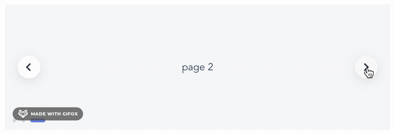
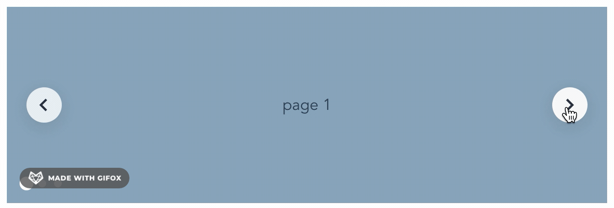
}我们在App.vue中使用下试试看:
vue
<DCarousel>
  <div class="carousel-item">page 1</div>
  <div class="carousel-item">page 2</div>
  <div class="carousel-item">page 3</div>
</DCarousel>
效果如下:

这样基本功能就完成了,最后我们完善下样式。
给分页器加一个容器carousel-pagination,分页按钮加一个svg图标:
html
<div class="devui-carousel-pagination">
  <button class="arrow arrow-left" onClick={ prevPage }>
    <svg width="18px" height="18px" viewBox="0 0 16 16"><g stroke="none" stroke-width="1" fill="none" fill-rule="evenodd"><polygon fill="#293040" fill-rule="nonzero" points="10.7071068 12.2928932 9.29289322 13.7071068 3.58578644 8 9.29289322 2.29289322 10.7071068 3.70710678 6.41421356 8"></polygon></g></svg>
  </button>
  <button class="arrow arrow-right" onClick={ nextPage }>
    <svg width="18px" height="18px" viewBox="0 0 16 16" version="1.1"><g stroke="none" stroke-width="1" fill="none" fill-rule="evenodd"><polygon fill="#293040" fill-rule="nonzero" transform="translate(8.146447, 8.000000) scale(-1, 1) translate(-8.146447, -8.000000) " points="11.7071068 12.2928932 10.2928932 13.7071068 4.58578644 8 10.2928932 2.29289322 11.7071068 3.70710678 7.41421356 8"></polygon></g></svg>
  </button>
</div>在carousel.scss中添加以下样式:
css
.devui-carousel {
  position: relative;
  overflow: hidden;
}

.devui-carousel-item-container {
  display: flex;
  position: relative;
  transition: left 500ms ease 0s; // 内容切换时的动效

  & > * {
    flex: 1;
  }
}

.devui-carousel-pagination {
  position: absolute;
  width: 100%;
  top: 50%;
  display: flex;
  justify-content: space-between;
  margin-top: -18px;

  .arrow {
    cursor: pointer;
    width: 36px;
    height: 36px;
    border-radius: 18px;
    background: var(--devui-highlight-overlay, rgba(255, 255, 255, .8));
    box-shadow: var(--devui-shadow-length-hover, 0 4px 16px 0) var(--devui-light-shadow, rgba(0, 0, 0, .1));
    display: inline-flex;
    align-items: center;
    justify-content: center;
    border: 0;
    outline: 0;
    transition: background-color var(--devui-animation-duration-slow, .3s) var(--devui-animation-ease-in-out-smooth, cubic-bezier(.645, .045, .355, 1)); // 按钮hover时的动效

    &:hover {
      background: var(--devui-area, #f8f8f8);
    }

    &.arrow-left {
      margin-left: 20px;
    }

    &.arrow-right {
      margin-right: 20px;
    }
  }
}
这样一个基础的Carousel组件就完成啦!
效果:

把内容换成掘金的图片试试:
<DCarousel style="width: 470px; height: 280px;">
  <img src="https://p1-juejin.byteimg.com/tos-cn-i-k3u1fbpfcp/0a4dda7abf534e098f04fe0e968b1e0c~tplv-k3u1fbpfcp-zoom-mark-crop-v2:0:0:940:560.awebp?" height="280" />
  <img src="https://p6-juejin.byteimg.com/tos-cn-i-k3u1fbpfcp/5e5b0b404fcb44ac9fb1359334186b46~tplv-k3u1fbpfcp-zoom-mark-crop-v2:0:0:940:560.awebp?" height="280" />
</DCarousel>
效果:

是不是已经和掘金活动页的轮播图非常接近了?
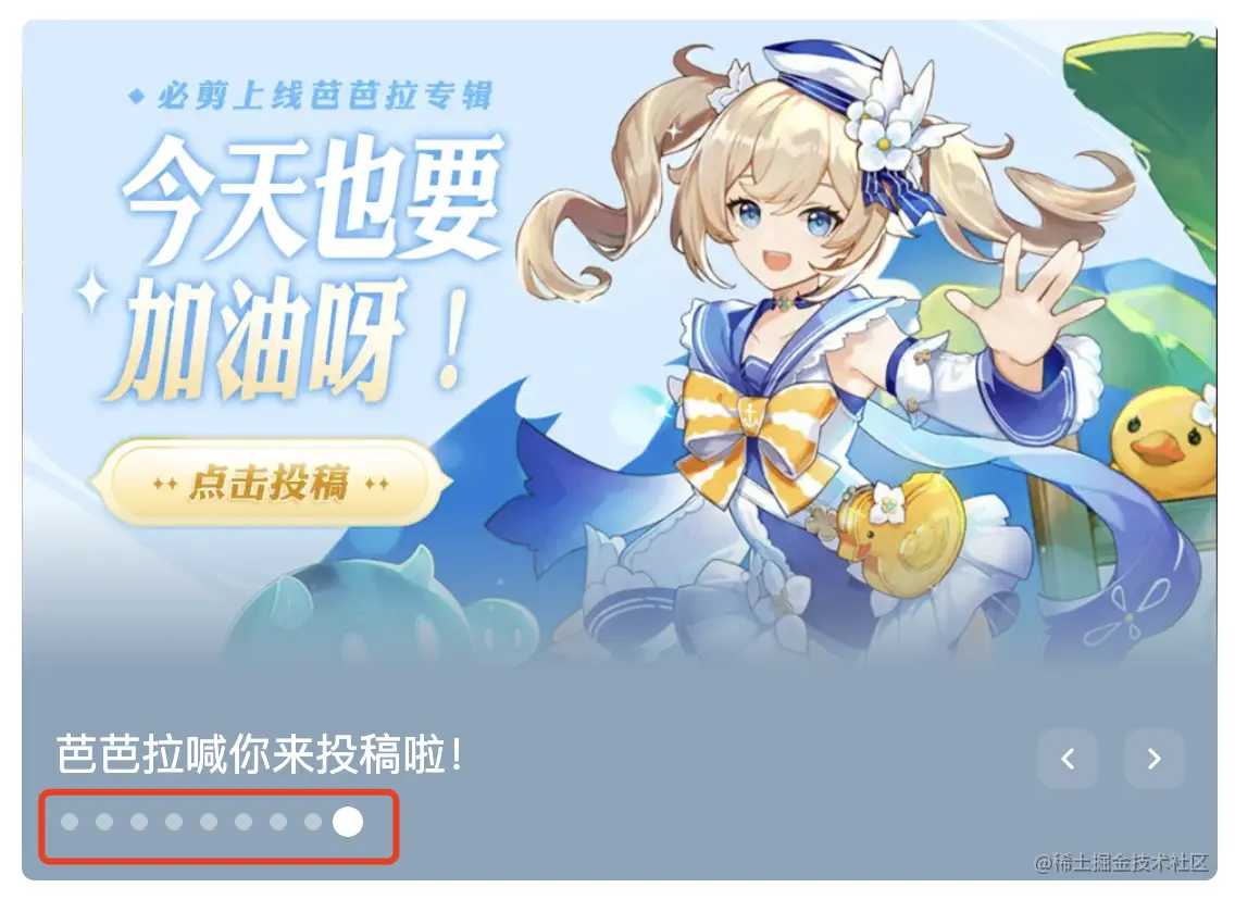
4 加上分页指示器
分页指示器兼具显示当前页码和分页两个功能,实现起来却非常简单。
先在carousel.tsx中增加:
jsx
import { defineComponent, renderSlot, useSlots } from 'vue'
import usePage from './composables/use-page'
import './carousel.scss'

export default defineComponent({
  name: 'DCarousel',
  setup() {
    const { pageIndex, prevPage, nextPage, setPageIndex } = usePage(1) // 跳转特定页码时,需要使用到setPageIndex方法
    const count = useSlots().default().length
    const indicatorArr = Array.from(new Array(count).keys()) // 生成指示器数组

    return () => {
      return <div class="devui-carousel">
        ...

        // 新增指示器
        <div class="devui-carousel-indicator">
          {
            indicatorArr.map((item, index) => {
              return <div class={`devui-carousel-indicator-item${pageIndex.value === index+1 ? ' active' : ''}`} onClick={() => setPageIndex(index + 1)}></div>
            })
          }
        </div>
      </div>
    }
  }
})
再完善下样式即可:
css
.devui-carousel-indicator {
  display: flex;
  position: absolute;
  bottom: 12px;
  justify-content: center;
  width: 100%;

  .devui-carousel-indicator-item {
    cursor: pointer;
    width: 6px;
    height: 6px;
    border-radius: 3px;
    margin-right: 8px;
    background: var(--devui-icon-fill, #d3d5d9);

    &.active {
      width: 24px;
      background: var(--devui-list-item-active-bg, #5e7ce0);
      transition: all var(--devui-animation-duration-slow, .3s) var(--devui-animation-ease-in-smooth, cubic-bezier(.645, .045, .355, 1)); // 切换内容时指示器小圆点上的动效
    }
  }
}
效果如下:


至此,功能完备的Carousel组件已经实现,用起来也非常简单,只需要把需要轮播的内容放到组件里面即可。
html
<DCarousel>
  <div class="carousel-item">page 1</div>
  <div class="carousel-item">page 2</div>
  <div class="carousel-item">page 3</div>
</DCarousel>
5 组件的分层和 api 设计
不过大家会发现这个Carousel组件还不能进行自定义,如果使用这个组件的开发者:
- 想调整
左右分页器的样式和位置 - 想调整
分页指示器的样式和位置
目前是做不到的。
还记得我们提到积木理论有一个抽象的思想,前面我们通过抽象的思想将Carousel最核心的交互抽象成了usePage这个composable。
除了抽象之外,积木理论有一个分层的核心思想,这个可以利用分层的思想将组件的能力暴露给外部使用者,可以在保持组件简洁性的同时,给开发者提供更大的灵活性。
比如用户想改变分页指示器的位置,将其放在轮播主体区域的外面,我们要怎么实现呢?
业界组件库的做法可能会增加一个api,比如Element Plus增加了一个indicator-position的api去实现这个功能,将这个值设置为outside,分页指示器就会在外面。

这样做会有一个问题,就是如果我想将分页指示器放在左下角怎么办呢?
比如B站这种:

是不是又要给indicator-position加一个bottom-left之类的呢?如果用户想放在上面、右边等其他位置呢?
与其不断地给组件加api,不如将组件内部的能力暴露出去,让开发者自己随心所欲地布局,想放哪里放哪里。
具体要怎么实现呢?我们一起来试试看吧。
5.1 抽离子组件
抽离子组件分成三步:
- 新建
carousel-indicator子组件,将相应的模板内容拷贝过去 - 拷贝
carousel-indicator子组件相关的样式 - 将
carousel中和carousel-indicator相关的代码删除,并用子组件替换
5.1.1 新建子组件
第一步是将需要定制的部分从Carousel组件中抽离出来,比如我们想定制分页指示器(Carousel Indicator),那我们就把它抽离成子组件carousel-indicator。
在carousel/src中新建一个components的目录,用来存放Carousel的子组件。
我们先在components下建一个carousel-indicator.tsx文件,然后将carousel.tsx文件中和指示器相关的代码拷贝到该文件中。
为了方便carousel-indicator的状态与carousel保持同步,比如:
- 通过分页器切换页码时,指示器也应该相应高亮
- 通过指示器切换页码时,内容也应该相应的切换
我们给carousel-indicator加一个双向绑定,绑定当前页码。
另外需要增加一个count以便于carousel-indicator渲染指定数量的小圆点。
jsx
import { defineComponent } from 'vue'
import './carousel-indicator.scss'

export default defineComponent({
  name: 'DCarouselIndicator',
  props: {
    modelValue: {
      type: Number,
    },
    count: {
      type: Number,
    }
  },
  emits: ['update:modelValue'],
  setup(props, { emit }) {
    const indicatorArr = Array.from(new Array(props.count).keys())

    return () => {
      return <div class="devui-carousel-indicator">
        {
          indicatorArr.map((item, index) => {
            return <div class={`devui-carousel-indicator-item${props.modelValue === index+1 ? ' active' : ''}`} onClick={() => emit('update:modelValue', index + 1)}></div>
          })
        }
      </div>
    }
  }
})
5.1.2 拷贝样式
第二步就是将相应的样式也拷贝过去,新建一个carousel-indicator.scss文件:
css
.devui-carousel-indicator {
  ... // 从carousel.scss中拷贝过来的
}
5.1.3 替换子组件
第三步就是将carousel中和carousel-indicator相关的代码删除,使用子组件替换。
jsx
<div class="devui-carousel-indicator">
  {
    indicatorArr.map((item, index) => {
      return <div class={`devui-carousel-indicator-item${pageIndex.value === index+1 ? ' active' : ''}`} onClick={() => setPageIndex(index + 1)}></div>
    })
  }
</div>
->
vue
<DCarouselIndicator count={count} v-model={pageIndex.value}></DCarouselIndicator>测试下效果和之前没有任何差别:

5.2 增加 indicator 插槽
在carousel增加indicator插槽逻辑:
jsx
{
  slots.indicator
  ? slots.indicator()
  : <DCarouselIndicator count={count} v-model={pageIndex.value}></DCarouselIndicator>
}
5.3 将子组件暴露出去
在carousel/index.ts文件中将DCarouselIndicator暴露出去。
jsx
import { App } from 'vue'
import DCarousel from './src/carousel'
import DCarouselIndicator from './src/components/carousel-indicator'

export { DCarousel, DCarouselIndicator }

export default {
  install(app: App) {
    app.component(DCarousel.name, DCarousel)
    app.component(DCarouselIndicator.name, DCarouselIndicator)
  }
}我们尝试在App.vue使用下子组件:
vue
<script setup lang="ts">
import { DCarousel, DCarouselIndicator, usePage } from './components/carousel'
const { pageIndex } = usePage(1)
</script>

<template>
  <DCarousel>
    <div class="carousel-item">page 1</div>
    <div class="carousel-item">page 2</div>
    <div class="carousel-item">page 3</div>
    <template #indicator>
      <DCarouselIndicator :count="3" v-model="pageIndex" style="justify-content: flex-start;padding-left: 12px;"></DCarouselIndicator>
    </template>
  </DCarousel>
</template>
我们发现指示器的位置已经移到了左下角,不过点击指示器并没有切换内容,点击左右分页器也没能改变指示器的高亮状态。
这是什么原因呢?
5.4 父子组件状态同步
我们发现指示器的状态和内容切换的状态并不是同步的:
- 指示器的状态绑定的是
App.vue中的pageIndex值 - 内容切换的状态绑定的是
carousel组件里面的pageIndex值
因此要想办法将两者的状态同步,可以给carousel组件增加一个v-model双向绑定。
jsx
import { defineComponent, renderSlot, useSlots, watch, toRefs } from 'vue'
import usePage from './composables/use-page'
import DCarouselIndicator from './components/carousel-indicator'
import './carousel.scss'

export default defineComponent({
  name: 'DCarousel',
  components: {
    DCarouselIndicator,
  },
  props: {
    modelValue: {
      type: Number
    }
  },
  emits: ['update:modelValue'],
  setup(props, { slots, emit }) {
    const { modelValue } = toRefs(props)
    const { pageIndex, prevPage, nextPage } = usePage(1)
    const count = useSlots().default().length

    // 同步监听外部modelValue和内部pageIndex的变化,实现父子组件状态同步
    watch(modelValue, (newVal: number) => {
      pageIndex.value = newVal
    })

    watch(pageIndex, (newVal: number) => {
      emit('update:modelValue', newVal)
    })

    return () => {
      return <div class="devui-carousel">
        ...
        <div class="devui-carousel-pagination">
          <button class="arrow arrow-left" onClick={() => {
            emit('update:modelValue', props.modelValue - 1) // 通过分页器切换时需要同步修改modelValue,确保外部指示器状态得到同步
            prevPage()
          }}>
            <svg>
          </button>
          <button class="arrow arrow-right" onClick={() => {
            emit('update:modelValue', props.modelValue + 1)
            nextPage()
          }}>
            <svg>
          </button>
        </div>
        ...
      </div>
    }
  }
})在App.vue中,让DCarousel和DCarouselIndicator组件绑定同一个pageIndex即可
vue
<template>
  <DCarousel v-model="pageIndex"> // 给DCarousel增加v-model
    <div class="carousel-item">page 1</div>
    <div class="carousel-item">page 2</div>
    <div class="carousel-item">page 3</div>
    <template #indicator>
      <DCarouselIndicator :count="3" v-model="pageIndex" style="justify-content: flex-start;padding-left: 12px;"></DCarouselIndicator>
    </template>
  </DCarousel>
</template>
这时我们再次:
- 点击分页器,指示器状态会相应变化
- 点击指示器,页面内容也会相应地切换

5.5 要定制指示器样式怎么办
如果用户想要更多的定制能力,比如定制指示器的样式,改成B站这种小圆点的形式。
这时我们内置的DCarouselIndicator组件已经满足不了用户的需求,需要做更深一层的定制,先给DCarouselIndicator组件增加默认插槽。
在carousel-indicator.tsx文件中增加:
jsx
setup(props, { emit, slots }) {
  const indicatorArr = Array.from(new Array(props.count).keys())

  return () => {
    return <div class="devui-carousel-indicator">
      {
        slots.default
        ? slots.default() // 增加默认插槽
        : indicatorArr.map((item, index) => {
          return <div class={`devui-carousel-indicator-item${props.modelValue === index+1 ? ' active' : ''}`} onClick={() => emit('update:modelValue', index + 1)}></div>
        })
      }
    </div>
  }
}在App.vue中自定义指示器:
vue
<script setup lang="ts">
import { DCarousel, DCarouselIndicator, usePage } from './components/carousel'

const { pageIndex, setPageIndex } = usePage(1) // setPageIndex用于自定义指示器的页面跳转
const indicatorArr = Array.from(new Array(3).keys()) // 用于渲染指示器元素的数组
</script>

<template>
  <div>
    <DCarousel v-model="pageIndex">
      <div class="carousel-item">page 1</div>
      <div class="carousel-item">page 2</div>
      <div class="carousel-item">page 3</div>
      <template #indicator>
        <DCarouselIndicator :count="3" v-model="pageIndex" style="justify-content: flex-start;padding-left: 12px;">
          // 自定义指示器
          <div
            :class="['carousel-indicator-item', pageIndex === item+1 ? 'active' : '']"
            v-for="item of indicatorArr"
            :key="item"
            @click="setPageIndex(item+1)" // 自定义指示器的跳转事件
          ></div>
        </DCarouselIndicator>
      </template>
    </DCarousel>
  </div>
</template>

<style>
.carousel-item {
  text-align: center;
  line-height: 200px;
  background: rgb(135, 164, 186);
}

// 自定义指示器的样式
.carousel-indicator-item {
  position: relative;
  display: inline-block;
  width: 8px;
  height: 8px;
  margin: 4px;
  border-radius: 50%;
  background-color: var(--devui-icon-fill, #d3d5d9);
  overflow: hidden;
  cursor: pointer;
}

.carousel-indicator-item.active {
  width: 14px;
  height: 14px;
  margin: 1px;
  border-radius: 50%;
  background-color: #fff;
}
</style>
效果:
5.7 还想自定义分页器?
照着自定义分页指示器的思路,将分页器抽成子组件CarouselPagination,暴露出去,并增加相应的插槽即可。
一旦将组件内部的能力抽离出来,并暴露出去了,用户可以定制的空间就更大了。
比如:
- 用户可以用我们暴露出去的
usePage核心分页能力去写自己的Pagination分页组件、ImagePreview图片预览组件 - 可以使用
CarouselIndicator和CarouselPagination子组件积木去拼接自己想要的几乎任意的走马灯效果,等于原来是一个整体不可拆分的Carousel组件,现在将其拆分成几个更小的小积木,让用户可以自己拼Carousel,也可以自己做一个相应的小积木零件,拼接到Carousel中,形成个性化的Carousel组件
发布时间: